If you have an article, marketing tip or thoughts you'd like to share, drop us a line at
deccatalkingpoints@decdesign.com
deccatalkingpoints@decdesign.com
Build Your Brand By Tinkering With Type
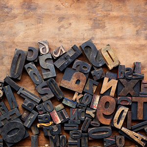
It seems like we marketers have been discussing virtually every aspect of branding since the early ‘90s. But there’s one branding topic that comes up much less frequently. Your typeface.
Typography is a vital part of your brand identity. The font you choose is your voice in written form. It’s a visual expression of your brand’s personality, be it professional, playful, informative, or irreverent. So if you want your typeface to accurately represent your business, here are several suggestions to get you started.
- Make sure your typeface communicates some trait of your brand. That makes it easier to connect with customers.
- Don’t select a font that will date itself. Trendy typefaces often vanish as quickly as they appear.
- Watch your weight. Heavy fonts work great for bold companies. Lighter faces communicate subtlety and simplicity.
- You can choose more than one face. Just make sure they complement each other in a way that supports your brand.
- Don’t forget about scaling and spacing. You can squeeze, stretch, or spread out a typeface until it looks just right.
- All caps isn’t for everyone. Uppercase letters feel strong and inflexible. Lowercase letters look more casual and approachable.
That’s a lot to think about, we know. In the end, try to find a typeface that looks contemporary, is easy to read, and feels like it was made for your business.