deccatalkingpoints@decdesign.com
A Brief Guide To 2018 Graphic Design Trends
In the era of digital art, graphic design trends come and go. Sure, some trends stand the test of time, but others vanish in the blink of an eye. New design trends are emerging and there’s one thing they are not—boring. This is beginning to look like a year of design experimentation and wild imagination. So, let’s look first at several graphic design trends and then a few typography trends you’re likely to see a lot of in 2018.
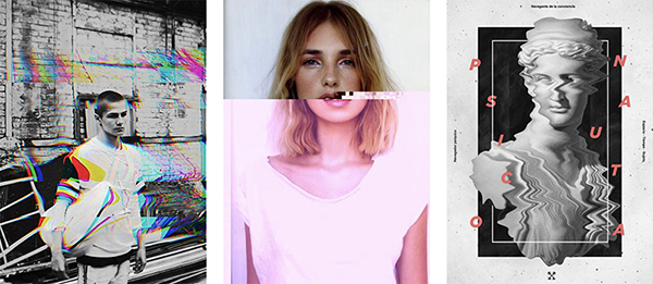
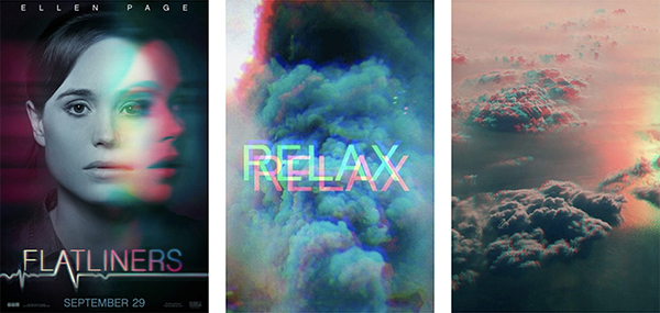
1. The “Glitch” Effect
The glitch effect is one of the most popular trends in digital design. What once would have appeared to be a technical issue is now a desired effect. Often employed by horror films, these corrupted images are taking over the graphic design world.
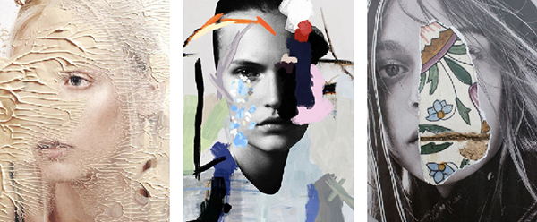
2. The “Ruined” Effect
It seems contemporary graphic designers may be obsessed with the “art of destroying.” Anything that includes splashing, scratching, ripping, breaking or ruining the aesthetics of a composition is now in vogue for 2018.
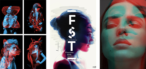
3. “Color Channel” Effects
Playing with color channels is pretty popular. The technique allows designers to produce some impressive artistic illusions. Holographs, hallucinations, and distorted realities are all color channel looks you’ll be seeing more of.
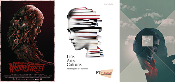
4. Double Exposure
The double exposure technique has been around for a long time. This year, it’s re-emerging in some eye-catching new ways. What was once old is new again.
5. Double Exposure Duotone
“Seeing double” no longer means you’re hallucinating. This trend combines double exposure, duotone, and color channel treatments. The look is achieved by overlapping distinct or identical images, creating the impression of jumping in time.
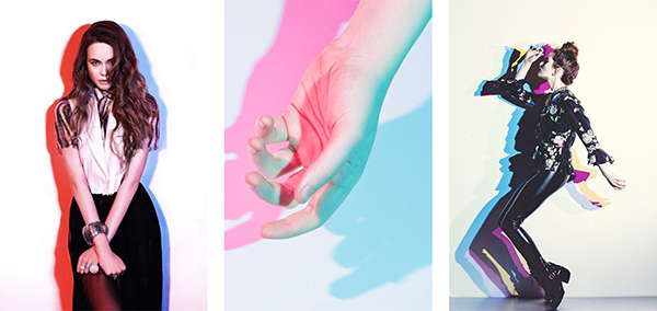
6. Double Light
Yet another double-image approach is the double light. This dual-color effect transforms simple compositions into edgy, modern looking ones. Double light is created by using two light sources or by splitting color channels.
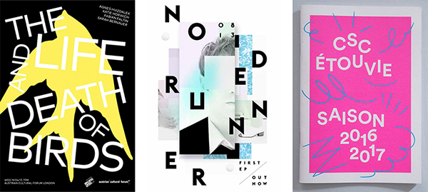
7. Creative Typography
Creative typography isn’t unusual, but in 2018, it’s taking our imaginations to bold, new places. It combines type, imagery, and ingenuity to produce some truly striking looks and compositions.

8. Cropped Typography
Cropped typography was a hot trend during 2017 and it’s still hot in 2018. Cropped typography is the art of removing parts of the letters while still maintaining readability. It requires a careful eye and uncommon creativity, but the results are compelling.

9. Chaotic Typography
Chaos was another top trend in 2017. Typography looks to become increasingly chaotic in 2018. Readability takes a back seat to design as misalignment and reordering letters are in the spotlight.
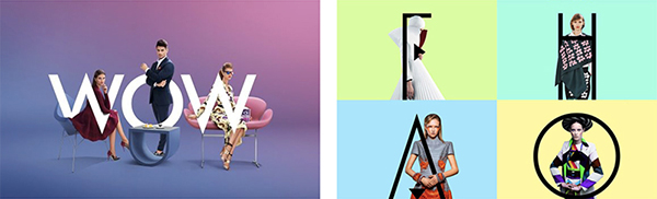
10. Typography as Real Life Elements
Another typographic trend is having letters interact with photographic images. In essence, turning type into real-life objects, or at the very least, incorporating them into visual compositions.
If there’s one thing we can count on, it’s that the upcoming year promises to bring forth some truly mesmerizing, engaging, and out-of-this-world digital designs. Watch as these trends progress and evolve in 2018.
Based on Top Graphic Design Trends 2018: The Ultimate Guide from graphicmama.com.